Translations: "Nederlands" |
New indicator predicts severity of the Corona pandemic many times better than R (Corona blog part 4)
The reproduction number R can today be found in many conversations around the SARS-COV-2 virus. In the media we hear politicians and OMT members say that the damned R just doesn't want to go down. Even last summer, when the ICs had practically no COVID-19 patients left, the R remained around 1. Mathematically, it cannot be otherwise, but many people do not realize that. Actually, R in itself is a very bad indicator to estimate the momentary spread of a virus. Why is that exactly?
The confusion surrounding R0 and Reff
But first a definition issue: especially at the beginning of the COVID-19 crisis, there was a lot of confusion about the difference between R0 and Reff. Even in the graphs of the RIVM the terms were often used interchangeably and even incorrectly. Time to put things in order:
The "Basic Reproduction Number" R0 is defined as: "the expected number of secondary infections in a fully susceptible population ". So this can only apply to the very first infection. Why? Suppose I return home from a far away country and bring home a completely new virus. Initially, I infect the people directly around me. Those people will infect others but me they can no longer infect because I already had it. The same goes for the others that I have already infected. Immediately after the first infection, the effective reproduction number (also called Reff or R for short) will therefore start to decrease because the population is no longer fully susceptible. R0 is by definition a fixed number for a particular virus (mutations excluded). Only the effective reproduction number Reff will be subject to change over time.
So when you hear journalists, politicians and even some doctors say that R0 is changing, then you know they haven't quite understood. They really mean Reff in most cases. So pay attention: the quality of the rest of the story could be at the same level.
When I talk about R in the future, I mean Reff and not R0.
The definition of R
R is defined as the number of new infections that an infected individual causes on average during his entire infectious period. R is an average for an entire population and usually cannot be measured directly in the case of infectious diseases. It can be approximated by the relationship between two so-called generations of infections:
R = Ii+1 / Ii, with:
Ii: het number of infected at generation i Ii+1: het number of infected at generation i+1
We can say that:
- In case R > 1 the spread of the virus is accelerating.
- In case R < 1 the spread of the virus is slowing.
- In case R = 1 the spread of the virus remains constant.
R is an interesting value for people who have to perform calculations on the spread of a virus. For example, you can try to predict what will happen to the spread in a computer model. Time and again we have been impressed upon by politicians and the media how important it is that the R remains below the limit value 1. Politicians put on stern eyes and wave warning fingers around when R is above 1 and praise the people when it falls below 1 again. Anything close to the value 1 seems to predict eternal doom. I have news: that's just not always true. In what follows, we will see that it is mathematically impossible for R not to approach 1 and remain that way as long as the virus exists, even when it is completely under control.
An example calculation
We can provide some insight with a simple calculation example. First of all, however, we will have to get used to the following situation: just as with flu viruses, it will probably never be the case that SARS-COV-2 virus will disappear completely. It will continue to haunt the world and statements such as 'the Netherlands must be free of the virus' are nice as an empty political slogan, but not very realistic. But it can be under control. For example, suppose the following, currently imaginary, situation:
There are still only 10 infectious carriers of the virus in the Netherlands. These carriers infect exactly 10 others. And they in turn 10 others. And so on. The following then applies:
R = Ri+1 / Ri = 10 / 10 = 1.0
This is not an inconceivable situation: for measles, although the vaccination coverage is high in the Netherlands, the virus does not completely disappear from the Dutch population. The RIVM says about this that normally between 10 and 20 measles patients are reported annually. The R for measles is therefore fairly constant and floats around 1. Sometimes it is a bit higher and sometimes a bit lower (otherwise the number could not fluctuate). And since the total number of infections (through vaccination) remains low, there is no reason to panic.
It is therefore to be expected (in fact, that is a mathematical certainty) that for the SARS-COV-2 virus, R will eventually hover around 1. This is not a cause for concern as long as the total number of infected remains low enough not to overburden our healthcare system.
Noise on the line
But there is an extra effect: as the total number of infections decreases, R will start to behave more wildly. The reason for this is that at low contamination numbers, small fluctuations in contamination lead to (short-term) violent fluctuations in the ratio that determines R. An example:
Suppose the 10 infectious persons from our example above infect 30 people at a certain time. R is then suddenly 3. If the iteration after that the number of infections decreases to 20, then the R is suddenly 0.66. As the absolute number of infections decreases, R becomes less and less valuable in making a realistic estimate of the spread of a virus. Fluctuations in the value of R should then be viewed with suspicion.
R is unsuitable for the Corona dashboard
The value of R is therefore actually completely unsuitable to give the average person insight into the course of the pandemic. In practice, it is a (sometimes) meaningless value that will always swing around 1 and thus permanently sends a kind of fear signal, even when everything is perfectly under control. A metric that seems to scream wolf all of the time causes unnecessary unrest at best and loses its credibility at worst.
A better indicator to replace R
Of course it must be possible to combine the value of R and the degree of infection in a value that actually says something about how well the virus is under control. Let's see how. To be able to do that, we first have to make a lurid choice, namely the following: how many COVID-19 deaths per day do we as a society find 'acceptable'? That sounds very strange and some people will say '0' but that is something that, realistically, we may never experience again (as with flu, measles, TB and other infectious diseases). So we have to make a choice. To help us with that choice, the ranking of causes of death in 2019 may be useful. I have listed a few numbers:
In 2019, an average of 416 people died in the Netherlands every day.
- 58 of them to the most common cancers.
- 44 of them from 'dementia'.
- 42 of them from cardiovascular disease.
- 26 of them from a stroke.
- 13 of them from an 'accidental fall'.
- 10 from lower respiratory tract infections.
This gives us some guidance. Obviously, the choice to be made is a political one. It must be weighed against the available care capacity, social and economic interests, etc. I cannot (and do not want to) make it here for our society, but for this blog I take it as an example in my calculation at 50. 50 people per day dying from COVID-19 may sound like a lot, but given the 'normal' daily deaths above, it may be quite acceptable, especially since a significant portion of them will come from the categories above. Instead of dying from dementia or cardiovascular disease, for example, you die a few weeks earlier from COVID-19. All things considered, not many more people die in total compared to normal, only the direct cause of death shifts.
Now that we have made this unsavory choice, we can, knowing from our previous blog that the IFR for a prosperous country like the Netherlands is approximately 0.23% on average, we can calculate how many infections are associated with it, namely: 50 / 0.23% = 21739 infected people. If at this number of infections the value of R is exactly 1, then the situation is just acceptable. R may be higher, but then the infected number of people must be lower. And if the infected number of people is higher, then R = 1 is no longer acceptable. In order to obtain a useful indicator, we must therefore multiply the value of R by the number of infected people divided by the number of infected people deemed acceptable. Because, as far as I know, this quantity has no name yet, I call it the 'Disease Control Indicator' (DCI) here. We can write the DCI in a formula as follows:
DCI = R x ( I / Ia )
With: DCI: the Disease Control Indicator R: the measured effective reproduction number I: the estimated total number of infected Ia: the number of infected deemed acceptable on the basis of the acceptable mortality and the IFR.
Just like R, this proposed indicator also has a trigger value at 1. Above 1, the growth of the virus is unacceptably large. Below 1, growth is under control. Nothing new at first glance, but as we will see in a moment, this indicator does not tend to hover around 1 when things are under control. And if things go wrong its value will be unmistakable.
An estimate for both R and I can be found in the data of the dutch Corona dashboard of the RIVM. And based on that, we can calculate DCI and make a graph. In the figure below we see three lines: the well-known reproduction number (green), the Disease Control Indicator DCI (blue) and the number of COVID-19 deaths (red). I have also put the limit value 1 in the graph with a black line:
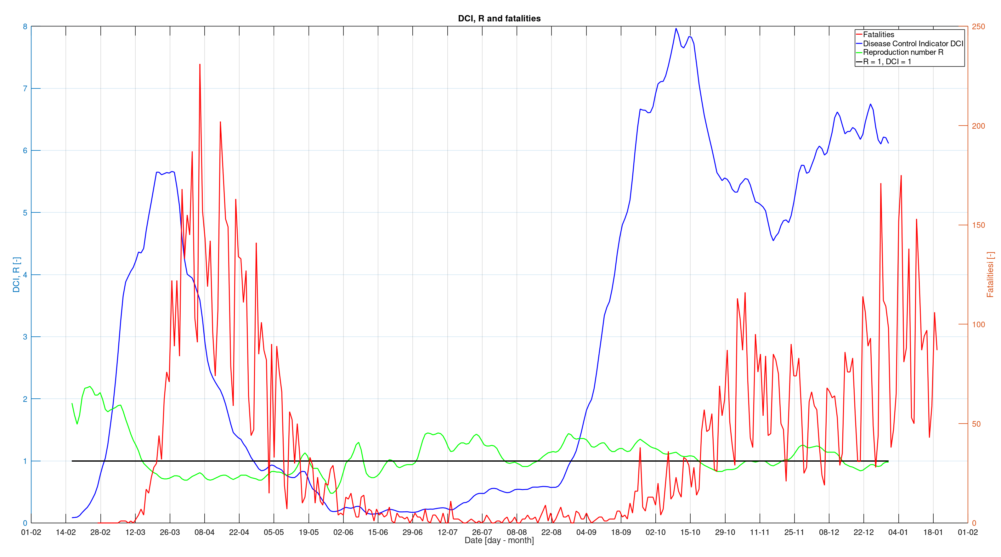
What do we see in the graph? We see the value of R in green indeed swinging around 1. In the summer months, when the ICs had virtually no COVID-19 patients and the number of deaths was only a few per day, it was even above 1 for a large part of the time. It also does not really show a significant warning when things start to go wrong again at the end of the summer. Not really a useful value when it comes to immediate insight.
Very different is the behaviour of the newly proposed indicator represented by the blue line. It is is clear that the virus was under control from the end of April. Throughout the summer that followed, the indicator remains well below 1, which was also entirely correct. Things go terribly wrong in the third week of August. Three weeks before the number of deaths starts to rise significantly, the indicator suddenly rises and progresses beyond the limit value. This alarm signal should have been a reason to intervene immediately. Instead, the measures were only adjusted around the end of September and it took until October 14 before a partial lockdown was imposed. Note that the effect of this partial lockdown is almost immediately visible in the indicator. So it seems that the proposed indicator DCI responds accurately to changes and would therefore be a good addition to the Corona Dashboard. In fact, the reproduction number R says very little to non-scientists and should actually make way for the DCI as far as I'm concerned.
What if we had had this indicator earlier?
The new indicator could have brought us a lot in recent times. It gives a very clear picture of what is going on with the virus and it could have been used to steer the measures that have left deep traces in our society more promptly and above all more comprehensibly for the people. I will mention a number of concrete advantages:
- From the beginning of May the measures could have been relaxed, terraces opened, parties allowed, etc. Instead, the measures were extended unnecessarily long and an unnecessarily repressive policy was pursued, which has led to sadness and frustration among many Dutch people.
- All summer long, people were kept in fear of an apparently threatening value of a meaningless value of R. This was unnecessary. Unless, of course, the goal was to keep people in fear.
- That same summer could have been used to experiment with phasing out measures because we would have had a good tool to evaluate what the effects of these relaxations were.
- At the end of August, everyone (including politicians, media and the population) could have seen that things went completely wrong. The trend break is obvious. Swift action could have been taken to correct the situation.
- A clear and understandable indicator could have fostered public understanding and guidance for politicians to take and to relax measures that, while perhaps necessary, seemed incomprehensible to most people.
The change in trend mentioned is interesting by the way. In a next blog I may look into this a bit further. I would like to propose a hypothesis: It may not be a coincidence that the sudden change in trend coincides exactly with the end of the school holidays...
Timing is everything
If we are to get through this difficult period as a society without permanent damage, it will be necessary to pursue clear policies. We have no use for doubting politicians who intervene too late or with meaningless measures. Nor does it help to frustrate the population by unnecessarily delaying the phasing out of obsolete measures. With the DCI I hope to give politicians a new weapon for timely and well-founded measures, but also to give them a clue for when those measures can be phased out again. At the same time I hope to give people without a scientific background a clear picture of what the virus really behaves like.
As a side note: Currently, important values the government's Corona Dashboard are 3 weeks behind. We have been told this is because some numbers are determined on the basis of hospital admissions and that they do not occur until 2 to 3 weeks after an infection. However, that has not been the case since June 13! Since June 13, RIVM has started using positive test results to determine important indicators such as the reproduction number. This means that these values can be displayed on the dashboard after the incubation period of 4 days or at most within a week! Policy makers would be able to react 66% quicker to new developments as they occur! Why this doesn't happen is a mystery to me. I wrote to the creators of the dashboard about this, but I have not received any response to date.
Conclusions
- The value of the effective reproduction number R is only meaningful in relation to the number of infections in the population. This is not reflected on the government's Corona Dashboard. This actually makes this indicator unsuitable for informing the public.
- With low contamination numbers, such as last summer, R has virtually no meaning anymore and publishing this value will only sow uncertainty and fear among the population.
- A more suitable indicator takes into account the number of infections in the population. I therefore propose to use such an indicator when providing information, but also when pursuing a better substantiated and, above all, more accurate policy.